PROFESSIONAL PRACTICE PART A
RESEARCH TASK
EDITORIAL ILLUSTRATION IDEAS AND CONCEPTS
MICHEAL PARKIN

Micheal Parkin is a conceptual illustrator, his editorial work interested me as it often displays pressing matters like housing issues (shrinkflation of homes shown in the Portaloo image) and environmental concerns in a humorous way. He does this by drastically exaggerating the issue and conveying it at its most extreme/unlikely state.
EIKO OJALA
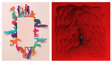
I was drawn to Ojala's work because of the simplicity in which he gets his ideas across, the backgrounds are often plain and the shapes/ shadow effects make up the idea. You don’t have to spend a long time considering what it means as he uses key visuals to help the reader make the links themselves. For example we can tell that one is about labour government and one is about teens and phones very easily.
JACK SACHS
EDITORIAL IMAGE MAKING
MAISY SUMMER
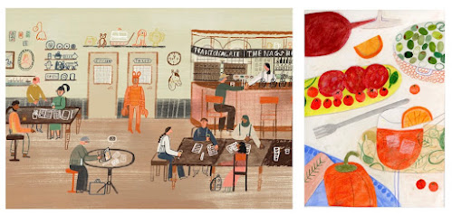
Maisy summer combines a variety of traditional drawing approaches like with paints, pencils and pastels and often mixes this with digital aspects too. I really like how this creates multiple fun textures within her work particularly within this one about pub quizzes for Financial Times. She also uses paper cutting and collage methods too.
CHRISTOPH NIEMAN
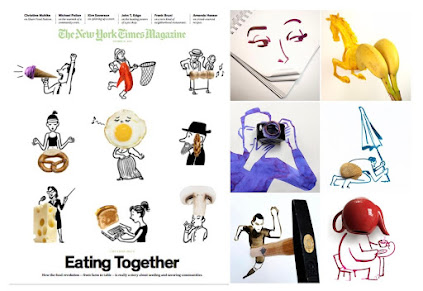
Christoph Nieman is inspired by everyday objects, he positions them on the page and creates illustrations utilising their shapes- then a photo of the drawing with the item becomes the final art piece. I think this unique way of working is very effective and shows an insider of how he looks at the world.
JOANNE JOO
MAGAZINE DESIGN
RUBBISH FAMZINE
ASAHI NAGATA
YUFEI YANG
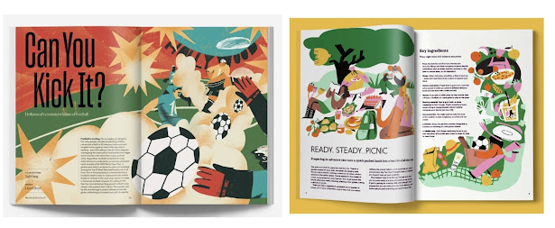
Yufei Yang's spread Can You Kick It stood out to me as I was flipping through Beneficial Shock as I really like the way the text and the illustrations interact with each other. It is the same with this other article I found done by her, the pages both feel dynamic and interesting to look at without an overload of text.
MAGAZINE TOPIC/ GENRE
IT'S FREEZING IN LA!
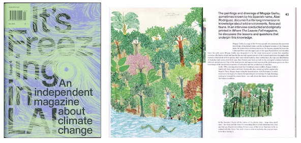
It's Freezing in LA! is a magazine for writing and illustrations about the climate and environmental issues. They want to communicate the issue in different ways and not rely on the overused imagery of ‘polar bears, floods and fires.’ I like how educational and important this magazine is but it keeps you interested with unique visuals.
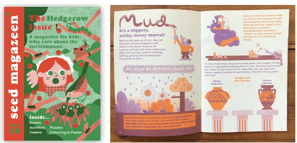
SEED MAGAZEEN
FISH BOWL FEVER
FURTHER RESEARCH
What techniques do editorial illustrators use to engage younger audiences?
For my final report I was drawn to looking at more children's magazines and spreads as I wanted to see how illustrators would adapt their work for a different audience. This is partly due to me being interested in children's book illustration.
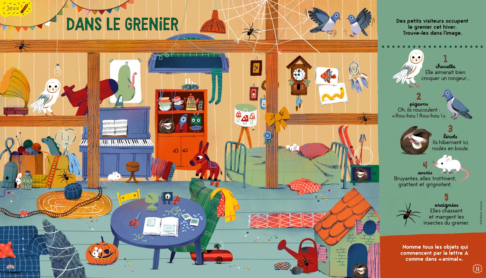
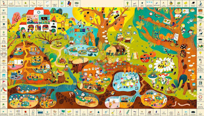
Many illustrators take the approach of making their work interactive and giving a chance for the child to ‘play’ with them. For example Maria Neradova makes these search and find spreads for the magazines Pomme d’api and La Salamandre magazine. This can get younger children who can’t read big chunks of text immersed in the artworks and provides a different function to magazines.
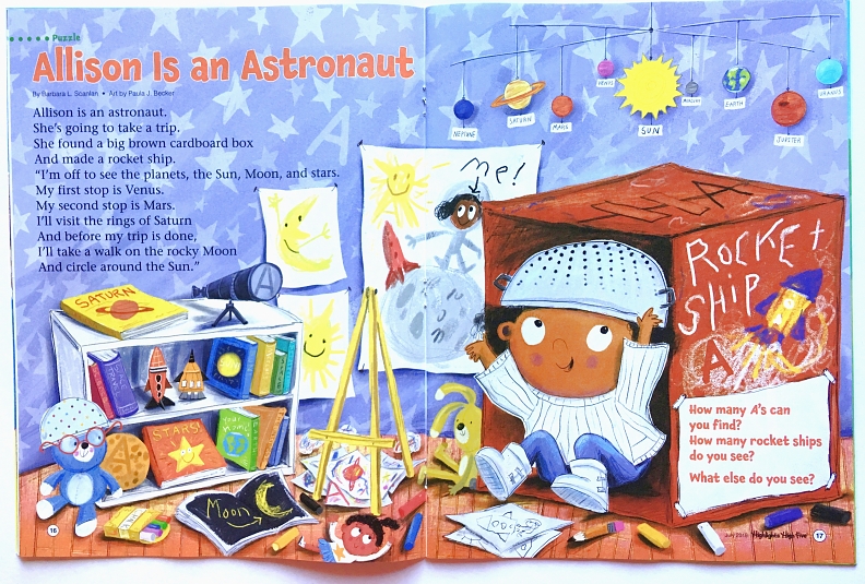
An important function of many children's magazines is to teach, so it is vital that illustrators are informative and accurate with their visual language. The spreads must be clear and engaging but the reader needs to learn something from it. This page for magazine High Five by Paula J Becker is a good example, it is easy to understand and provides information about the planets, their order and how they circulate the sun with the mobile at the top. Thought has gone into it and it isn’t misleading.
Similarly these spreads for a Russian older kids magazine by Victoria Steblava (who specialises in non-fiction art) show depictions of close up of animals and plants that are easy to interpret.

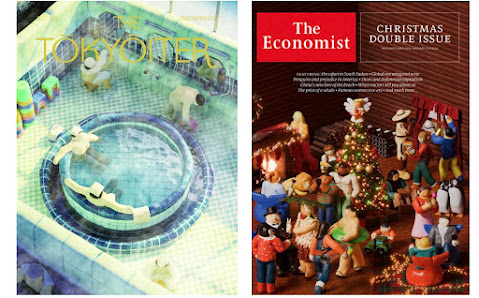
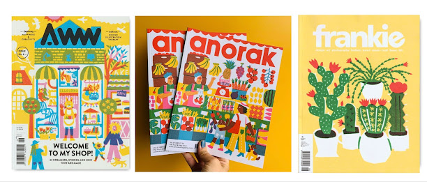
A key difference to other magazines that really stood out to me is that the majority of children’s magazines tend to have super bright colours throughout. For example all of these covers-

EDITORIAL ILLUSTRATION LECTURE NOTES


Comments
Post a Comment