NARRATIVE AND SEQUENCE FINAL OUTCOME
NARRATIVE AND SEQUENCE FINAL OUTCOME
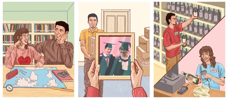
MY SCROLL ILLUSTRATIONS THAT ARE INSIDE THE WINE BOTTLES
MEETING- PART 1
Potent flavours of romance and new beginnings, pairs well with nostalgia.
REDUNDANT- PART 2
Bitter with a combination of loss and hope, releases a sensitive palette of emotions.

OPEN- PART 3

EVENT- PART 4
A well balanced wine with tastes reminiscent of the comfort of newfound community.
2014

VIRUS- PART 5

FAMILY- PART 6
A sweet and pleasing structure, if well loved this wine will improve over the years.
2025

PICTURES OF WINE CASE 'BOOK' AND BOTTLES 'CHAPTERS'


EVALUATION
For narrative and sequence I was inspired by the more abstract interpretations of artist books presented, I particularly like the few based on buildings which is how I figured out my starting point. When I thought of buildings I realised that an important landmark in my and my family's life has been my parent’s wine shop. I was interested in further exploring this idea as I thought that it lent itself towards creating something 3D which I haven’t explored in this course yet.
To make this ‘book’ contain a narrative I had a multitude of ideas that I tested. Initially it was going to be very simple having the box’s exterior as the shop front and the inside with the shop floor and stock rooms, However I thought this was boring and lacked a family connection. So instead I interviewed my parents about the history of their shop and that is what I based the story and sequence on.
My main idea for the physical structure of this book was to base it on a wine case (the cover and binding) with bottles (the chapters) and each bottle would have a rolled scroll inside (the pages) telling a sequential story about my parents and the shop. It was also important to me to have my initial idea of the shop front on the outside of the wine case. I knew that making a traditional 6 bottle wine case would be too big and clunky so I opted to use half bottles instead. I thought that the best way to mimic the shape of the shop front was for it to have a roof instead of it being flat.
I sourced the majority of materials from my parents' shop: the cardboard, bottles, and labels I printed for them. For the narrative part I tried out digital art- I did this because I’m inexperienced in using photoshop and wanted to improve my skills, I also thought it would be quicker to colour and finish in the time we had.
The storytelling scrolls cover the whole lifespan of the wine shop starting with my parents meeting and working in chain wine shops, to them opening an independent one to finally my whole family working there together. I used colour schemes for each part which I think helps tie each image together as well as match the emotions of the scenes. Within these digital illustrations I tried to include little easter eggs of family/wine shop photos I found whilst researching.
Overall I am happy with my outcome. I think that the theme of my book really shines through and I'm very glad I was able to improve my digital art skills. However I think that the scrolls inside the bottles are too difficult to get out and put back in which ruins the reader's experience a little. I also think that although intentional, the inconsistent colour schemes between the parts are extreme- it separates them a bit too much .
Comments
Post a Comment