For this project I decided to join a group with Izzy, Molly and Xena as I have yet to do this in this course and thought that the combined efforts of 4 people would create a much more detailed, interesting proposal.
We chose mini brief 1- change someones day- as our prompt and then as a group we decided to focus on the topic of periods as its something we can all relate to. We initially agreed that our main aim would to try and de-stigmatise them and bring awareness to certain individuals that have different experiences to what is considered the period 'norm'. This would ideally change perspectives and 'someone's day'.
To kickstart our period project we created this survey to send around to people who menstruate in order to gather data on period stories that we could possibly use for a menstruation magazine containing comic journalism.
^ QR CODE TO SURVEY
We also each made a poster to put around Bower-Ashton with QR codes that link to the survey in a hope to gain more responses. Making these posters was also a good way to see how our styles all look together and to brainstorm imagery that might relate to periods. We wanted them to show periods in a real way with none of that blue blood bullshit so I think they all have a certain shock value to them that will hopefully attract more scans!
^MY POSTER
^ ALL OF OURS TOGETHER
^ SOME OF THE PLACES WE PUT THEM
MINI BRIEF IDEAS
Whilst waiting for responses we continued to ideate on what our proposal may be and tried to create a kind of draft manifesto, here are our notes-
PERIOD PRODUCT MARKETING
We are interested in the way that period products are marketed and how the packaging and adverts look very girly and cutesy when periods themselves are definitely not cute, with the idea of possibly parodying this we went into shops to investigate and looked at online sources.
^Mind map of my findings based on shops in Bristol.
^Sketchbook pages of ideas
Research into ads I like and dislike:
BODYFORM- It's never just a period
I really like this Bodyform advert, It shows different experiences with periods, the painful and emotional sides- stuff that is usually censored. It's a lot more real than the average ad and does a really good job arguing for social change in the form of more information/education about periods. Plus that tense music really embodies the whole period experience. Bodyform in general is in my opinion one of the better brands for reducing stigma- it being the first brand to change the blood in ads from blue to red and to show men buying sanitary products. This is the kinda of ad that inspires me to make something similar..
TAMPAX- New Tampax Compak
These ads however I don't like and is the sort of thing I had in mind when we're talking about mocking ads. The reason I dislike this is mainly because I feel that it has nothing to do with periods at all, nobody gets the urge to roller skate on a beach like this when they put a tampon in! It's patronising.
CHANGE SOMEONES DAY INTERVIEWS.
^ Me at college green ready to interview
One of our ideas was to go out into the streets dressed up as period products interviewing people about period stigma, interesting facts about periods, and people's general experiences. I think this would definitely change somebody day!
RESPONSES ZINE PAGES
We ended up getting 41 replies (and counting) to our survey! Once reading them it made the most sense, for our final visual essay, to continue with the initial idea of comic journalism- documenting the replies in our own art styles and trying to get their message about their periods across. To do this It made the most sense to create a zine as a sort of archive, in my opinion this is the best format to showcase how the period experience is different for everyone as we could make loads of pages!
^ OUR EDITORIAL STATEMENT & ZINE PURPOSE
Next we sorted the replies out to decide who would use each one in our illustrations. Over the easter holidays we aimed to do 8 each all fitting under three categories: longer comics for the longer replies (double page spread), single panel comics and text heavy pages. We also wanted to print using riso to give it that indie zine vibe so made sure we kept it in only 2 colours.
^ GUIDELINE FOR PAGES
I started my period on my actual 13 birthday! Was not a nice birthday, I was very sick and the pain was awful!Until I had children every month was sickness and diarrhoea.
I haven’t told anyone but my husband this but it is my most embarrassing moment: it was the first day meeting a new male colleague. It was the 1990s when period were still something only women talked to each other about. We were in the office, had a chat and a plan, he seemed very approachable and I thought that would enjoy working with him. I took my keys out of my 1990s tightish jeans pockets and out of the corner of my eye something else flew out too. He picked it up and asked “Is this yours”? A lillets tampon. The sheer embarrassment. Of course I said “yes” , took it from him and fled. 30 years later I am godmother to his son and although we live away from each other our families regularly get together. I have never spoken to him about it! I wouldn’t be in the least embarrassed now, my 17 year old talks to us about periods, knows all about the menopause and there’s no impressment
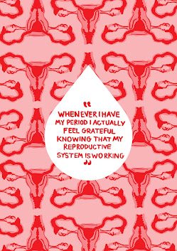
Whenever I have my period I actually feel grateful knowing that my reproductive system is working. I often hear people hating theor period which is valid due to the pain and other reasons but I always feel a sense of relief which I've never actually heard anyone talk about.
I was at a conference in Thailand wearing a cream dress when my period unexpectedly arrived. Thankfully I didn’t leak onto my dress but I didn’t have any tampax on me so I ran to the loo and stuffed a wedge of rolled up toilet roll into my knickers as an interim measure. At the end of the session, I was shuffling out of the room when the toilet roll fell out of my pants and onto the floor infront of about 50 male colleagues. To say that I was mortified would be the understatement of the century (sorry Frankie for sharing that tale!)
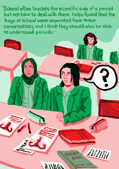
I had many friends at school who had no idea what was happening when they got their periods for the first time. School often teaches the scientific side of a period but not how to deal with them. I also found that the boys at school were separated from these conversations and I think they should also be able to understand periods. Also I believe there should be more information about conditions such as PCOS, endometriosis etc.
I've now finished my periods (gone through menopause) and yet, can you believe, after nearly four decades of periods I never did find out if my periods were light, 'normal' or heavy. This was never properly talked about - just mentions of 'expect no more than a teaspoonful of blood'... what about consistency, irregular flow, how much periods change from month to month depending on other factors (stress, weight, illness, post-childbirth, perimenopause). Rollerskating in white jeans still isn't possible for every menstruating woman just cos they're wearing Tampax! More specific information should be available. No one should be left wondering if they are experiencing something wildly different, similar, identical to others. Period poverry is thankfully getting more headlines but don't get me started on the sterotype about having periods - irrational, tearful, raging hormones... menstruation is different for everyone and it changes throughout your life.
Multiple times when going to the doctors, my own experiences with pain has been affected by the fact I have periods. My periods are painful but despite this they aren’t taken seriously. Other conditions or issues I’ve wanted to check on have also been brushed off due to the fact I have periods.
^ THE RESPONSES I CHOSE TO USE
(RED= SINGLE PAGE COMIC, BLUE= TEXT HEAVY, GREEN= DOUBLE PAGE COMIC)
^SKETCHBOOK PAGES
^ MY FINAL SPREADS- They each have very different themes and opinions on periods. This is the first time I've used such a limited colour palette so I tried to make the most of layering different opacities of green and red to create more shades for extra detail.
RISO PRINTING DAYS
After arranging the spreads and pagination (thank you Molly!!!!) we got to printing! We had to do one side of the spread leave it to dry and then come back. This was my first time using a riso printer and I was happy with how my spreads came out- some of them were slightly misaligned probably because I layered so many shades, etc but I think that that's part of the riso joy.
We created our masters digitally!
^ One of mine -slightly misaligned but happy with how the colours mixed!
CHANGES
After our first day of printing we had a tutorial with Phil. He gave us some valuable feedback relating to the overall flow and layout of our zine. The main problem which we overlooked was because we all individually did a lot of single pages based on responses, more often than not, the artwork next to it on the double page would be unrelated... but would look like it was part of the same story. Since we had already printed half the zine we came up with the solution of instead of reformatting the physical version, to just print the front and back covers with flaps on both side (a book sleeve) detailing the contents relating to each page number. This also meant that we could use a thicker paper for the front cover as we didn't do that initially.
^ Contents Page- Instead of titling it contents it made more sense to use the question we asked in our survey as that provides more context to the reader. We all came up with titles for our illustrations which fit the overall theme of them.
FINAL ZINE
^ FINAL PRINTED ZINE (without sleeves)
^ ZINE WITH IT'S JACKET
Linking back to one of our initial ideas of creating new packaging for period products we decided to package our zine in a period pad style way. For this we used tracing paper so you can still see the zine inside and to mimic the translucent quality of the actual pad material in it. We all made ours so it folds over and has a little sticker- similar to how an actual pad looks and opens. Lots of pads have flowery, cute designs on them so for my pad style sleeve I wanted to mock this.
^MY PACKAGING DESIGNS
VISUAL ESSAY EVALUATION
During this Visual Essay module I worked on two projects simultaneously. This was a unique challenge in balancing the workload but as I am passionate about both themes, it motivated me to continue with both.
Go with the flow, our group zine archive on menstruation experiences, exceeded my expectations. This was my first time working as a collective and as I found out, it has many merits. We were able to bounce ideas off each other which further developed our proposal research and we were able to create a much more detailed outcome with 36 pages. This was my first time working with Riso print so I have learnt a useful new skill, whilst also developing my ability to use comic journalism. However I think we could have improved on the structure of the zine, it would have been better to plan a wireframe of the whole thing instead of jumping into the spreads straight away.
In my individual project, Wasteland Wandle, I got to refine my documentational illustrative skills and conduct research into pollution in rivers. I think the monochrome art with colour highlighting the pollution and the contrast with the nature poems helps to document how disgusting rivers have become and like my aim, educates people on this. Although ‘finished’ I want to possibly continue with this project, extending it beyond the small, fairly unaffected River Wandle and looking further into these water companies who profit off the destruction of our rivers, this would add much more depth and get my point across better which is why the zine unfortunately remains unprinted.


Comments
Post a Comment